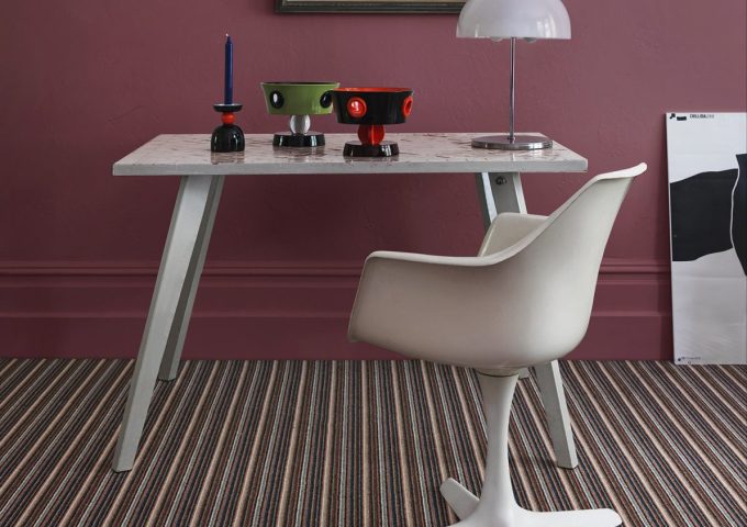
While beautiful, bold colours can be difficult to implement in any interior scheme. A strong palette can quickly become overpowering, especially when paired with a statement pattern. Nevertheless, statement shades bring a range of benefits, from the soothing hues of blue to creativity-inspiring crimson. This inspiration gallery offers a little insight into styling bold colours from our in-house interior experts, including a range of different design styles.
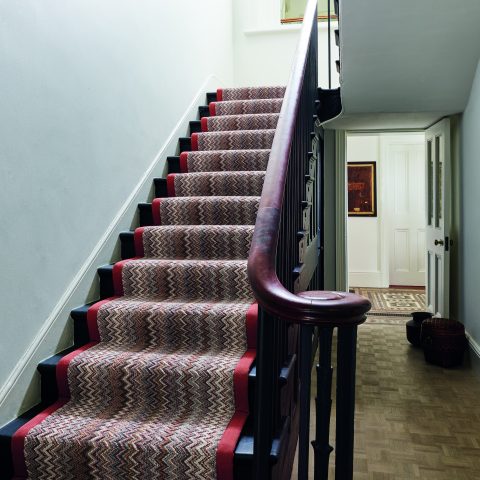
From striking scarlet tones to a striped kaleidoscope of colour, bright styles often look best in small or dark spaces, where they can bring a dash of light and drama. Try them in the hallway or on the stairs to dazzle guests with a fabulous welcome. Alternatively, you can try pairing vibrant flooring with white walls and furnishings in larger spaces for a luxurious and contemporary finish.
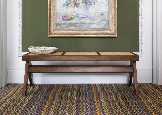
Many people believe bold colours are reserved solely for ultra-modern schemes, but we are here to show you that isn’t always the case. This inspirational gallery offers some intriguing ideas about implementing strong shades if you have a more traditional style or property, offering insight into how they might look when paired with rustic design elements.